R is for Resources

Hi! My name is Tyler Taaca, and I am your VP of Membership Development, and for this RED article, we’re talking about resources. So what resources am I providing, you may ask. The resources we are sharing are for slide decks! As a student at Schulich, these past three years have been filled with slide decks that I have made for projects and case competitions.
Before we get into these resources, we should probably understand a slide deck and its components. For business purposes, a slide deck is a collection of pages that act as the visual component to aid the story of a business strategy, whether that be a marketing plan or a product feature proposal. Crafting a consistent narrative on each of these slides can be daunting and hard. There is a constant balance act between information and capturing one’s attention; having too much of one or the other can yield unfavourable results.
I wish that someone would have given me these resources when I had been in my first year of Schulich. Below are just some of my tips and resources to hopefully make your slide deck journey just a little less bumpy.
Tip 1: Know What Program You Want to Build On –
When you hear about slide decks, the first thing that business students think about is PowerPoint and Google Slides. Although PowerPoint and Google Slides are the most popular program to develop slides, a lot of students are diversifying the tools they use to make powerful presentations. A new popular program that has been used to create slide has been Canva and Photoshop. Both programs are typically used for photo editing and digital art, however, if one were to set the dimensions of their canvas to the typical dimensions of a PowerPoint slide, you can make slides on Photoshop and Canvas. This has added benefits that allow a user to do things such as controlled layering, image type creation, and the creation of gradients.

Tip 2: Being Iconic Through Icons –
A lot of students rely on pre-made icons on PowerPoint, however, there is so much more out there! Icons can be used to set the theme of a presentation and can be a great visual cue that allows the user to remember points better. A website that I find myself using a lot is Flat Icon, which is a database of themed icons that can allow a presentation to be cohesive. There are icons of a wide array that can span from healthcare to fintech, and what’s even more impressive is the fact that if you sign up for a free account, you can edit the colours yourself if they are not to your liking. If you are going to use visual icons, Flat Icon should be your number one spot.

Tip 3: Planning on Pinterest –
Now I know what you’re thinking. Pinterest? Is that not for mood boards? Well, yes, however, what people do not know about Pinterest is that it is an amazing resource for slide inspiration. When making slides from freelance, students tend to get stuck on how to plan out a slide. It’s extremely frustrating, especially when you are doing something like a pressure tank case competition. When using Pinterest, use the search bar for a specific slide theme, and corresponding or similar slides will match your search. What is great about using Pinterest posts is that a lot of posts will link to the author of the slide deck design, and if you do like that design you can purchase it. As you begin to build an eye for what you like, you can then use the pin-to-board button to get more slides that correspond to your style. Happy Pinning!

Tip 4: Color, Color, and Color
Some of the most beautiful images are formed based on colour. Although it seems subtle, a colour palette can be the roadblock a lot of students experience when making a PowerPoint. Before you go around painting everything with every colour, here is one rule that has made all the difference for me when designing slides. The rule is called the “70,20, and 10” rule, which states that a slide decks colour palette should be made with 70% of one colour, which would be known as the primary, 20% of one colour and 10% of another colour, which are called secondaries. A great website to create these palettes for free is called Coolors, which is an online page that auto-develops a set of colours that work well together and can adhere to the “70,20, and 10” rule.

Tip 5: Mock-ups
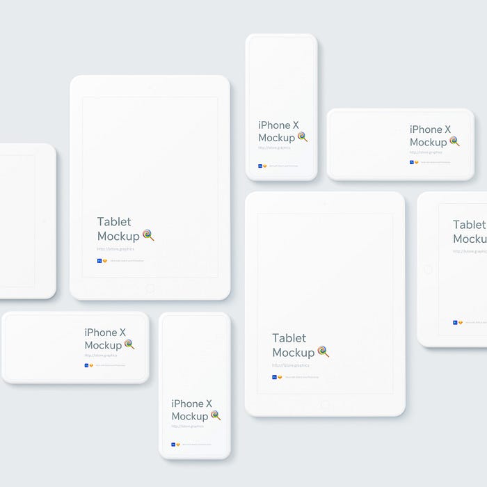
This tip, when I had learned about it, changed my slide deck presentations so much. If you have ever wondered how some presentations have realistic prototypes of phone apps, consumer products, or user interfaces, then you’re going to want to know about mock-ups. Mock-ups are pre-made PhotoShop files that allow a user to import their graphics to everyday items. The only pre-requisite to this is that you have Photoshop. To access these types of files, a simple Google search with the item you want to present plus the word “mock-up” will redirect you to websites that have Photoshop files that match your item.

I hope you enjoyed my five tips and resources for creating a slide deck. If you have any questions, feel free to reach out to our Instagram at @YorkMarketing.